

Today, we’re excited to unveil a simple yet powerful hack that can significantly enhance the legibility of text over image in Divi. This handy tutorial is part of our Divi Basics series, designed specifically for those who are just dipping their toes into the vast world of Divi. However, it’s surprising how many users remain unaware of this clever trick, which can truly elevate the readability of text on images.
In this tutorial, we’ll walk you through the steps to implement this hack seamlessly within your Divi projects. Whether you’re a newcomer or a seasoned Divi enthusiast, mastering this technique will undoubtedly add another valuable tool to your design arsenal.
So, let’s dive in and unlock the potential to effortlessly enhance the legibility of your text-over-image elements in Divi.
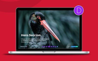
There are many ways of adding text to our images but we are going to start with the most simple one. We would create a section or row with an image in the background and we would add a text module inside it, like in the case of ‘Text Over Image In DIVI‘. In addition, we will add some space and center the text to have the same result as this one:

The most important part here is to add the same space both up and down so the title stays centered and also some space on each side to avoid the text being close to the edges.
Even if you align the text with the center we recommend you to add some space to sides to avoid the text being too close to the edges on mobile devices, especially when dealing with elements like ‘Text Over Image In DIVI‘
Add an overlay layer to our image
As I showed you in our previous image, the text is not quite legible, right? This is not normal and this is why I am going to show you how to fix it!
Adding an overlay layer
Divi allows us to add several background: image, video, solids, gradient, etc. Today we are going to use the gradient so we can add an extra layer that will grant our text to be more legible. So the gradient appears on top of the image, don’t forget to enable the option “Place Gradient Above Background” as it is shown in the image. Otherwise you won’t see any changes.

As we have seen in the previous example the gradient that we have used is pretty subtle. In both sides of the gradient we’ve used the black colour with a 20% opacity, this is why the result of the image was a bit darker than the other one. We can also use different colours or just adjust the intensity of any of these.
Text Over Image In DIVI
In conclusion, mastering the art of enhancing text over images in DIVI can truly set your designs apart and elevate the overall user experience. As web designers at Destaca Imagen, we understand the importance of not only delivering visually stunning websites but also ensuring optimal readability and engagement. With our expertise and the right tools at your disposal, such as our meticulously crafted plugins and themes for DIVI, you have the power to create immersive online experiences that captivate and resonate with your audience.
So, whether you’re a seasoned developer or just starting out on your design journey, remember that the devil is in the details, and even a seemingly small tweak like improving text legibility can make a world of difference. Explore the possibilities with Text Over Image In DIVI, and unleash your creativity to craft websites that not only look fantastic but also deliver exceptional user experiences. Let’s elevate your designs to new heights together.
What do you think about this hack? Interesting? Basic? Leave us your opinion below. 🙂


0 Comments