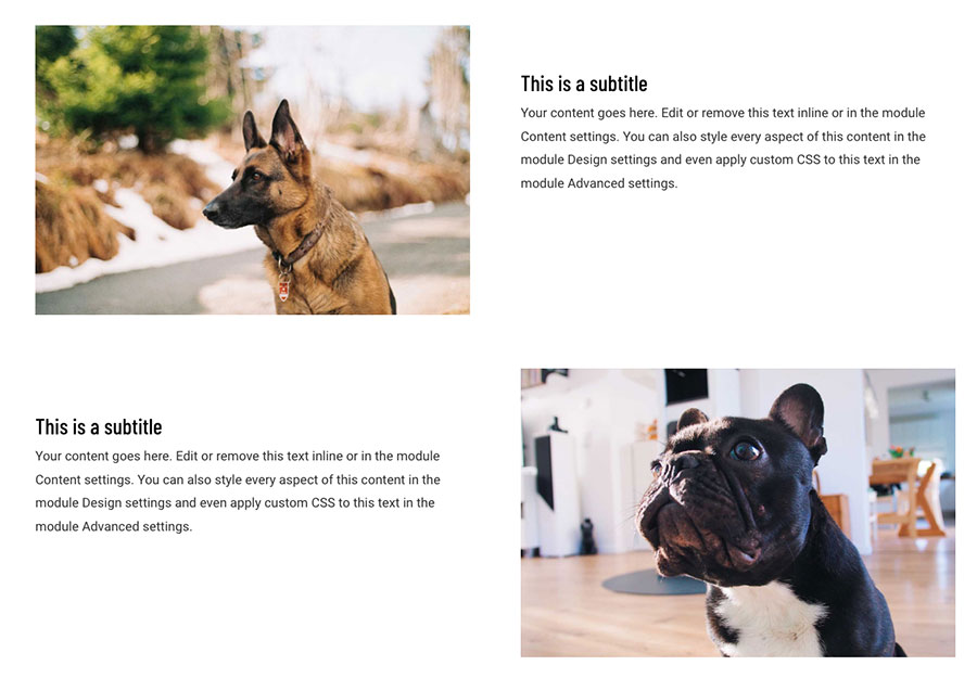
Divi is a great builder with a lot of options available that will allow us to work on any web project. But sometimes it is necessary to use some CSS if we want to get the best result. In the example of this post we are going to see how to change the Divi column order on mobile. Why is this necessary? Here is the problem:
Why is Column Reordering in Divi for Mobile Devices Important?
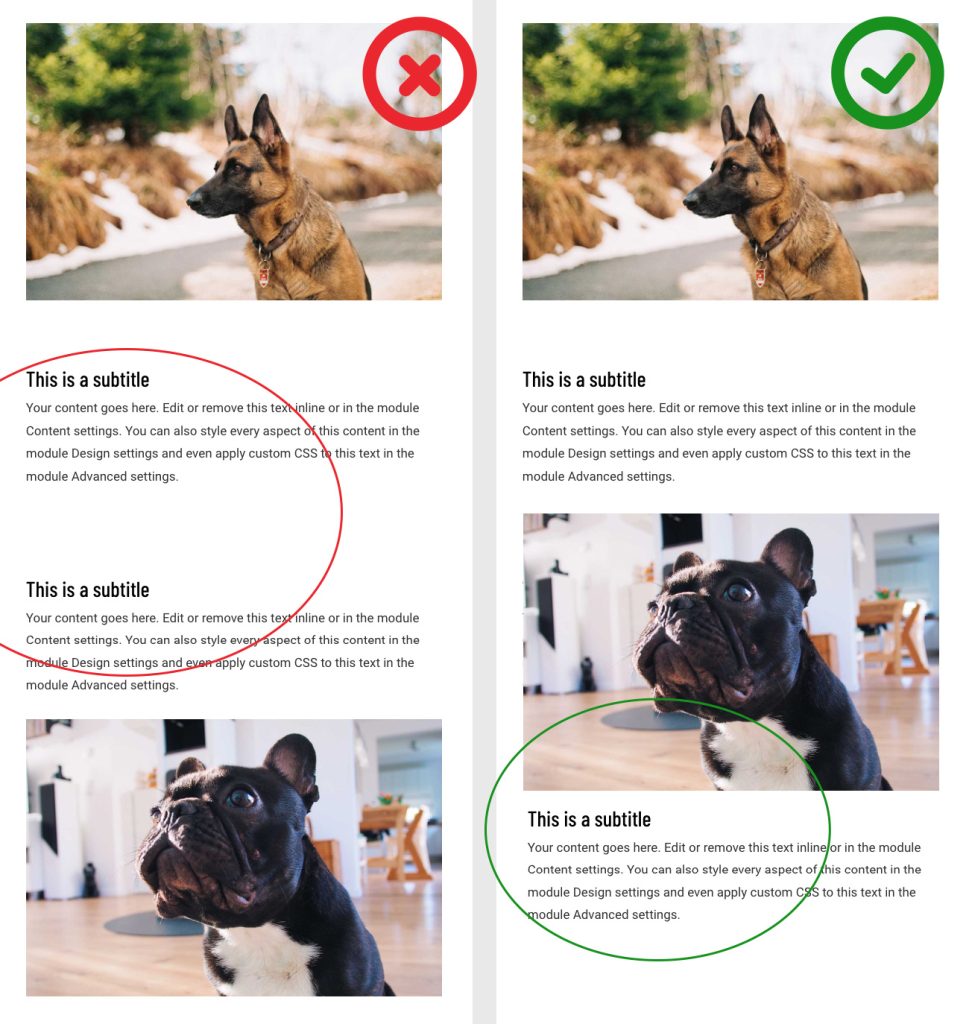
Imagine this scenario: you have designed a gorgeous website in Divi with perfectly structured columns and sections in the desktop version. However, when accessing it from a mobile device, the layout becomes a challenge. This is where Divi’s ability to change the column order comes into play.

As we can see in these images if we use this layout when we view the website in a mobile device the result is this one:

CHow to change the order of the Divi’s columns with CSS. These adjustments can be the key to delivering an exceptional user experience. Imagine being able to present the most relevant and eye-catching information on the mobile screen, right where users expect it? That’s the promise that this Divi feature delivers: the ability to intelligently tailor your content, ensuring that every visit from a mobile device is just as impactful as from a desktop computer.
How to change the Divi column order on mobile?
We’re going to need a bit of CSS. First we’ll need to add an extra class to the row where we want to change the column order. We will use the “reverse” class. Then we will add this CSS code in the customize appearance section of WordPress:
@media all and ( max-width: 980px ) {
    .reverse {
        display: flex;
        flex-direction: column-reverse;
    }
}
This level of adaptability and personalization not only improves user retention, but also directly influences interaction and, ultimately, your conversion goals. From highlighting a crucial call to action to presenting products or services in a more engaging way, the benefits of this practice transcend simple aesthetics to create an experience that impacts and connects with your audience.
Here’s a video walkthrough of the process:
What did you think?
Change the order of Divi columns on mobile. We hope you find it easy and that you can use it in your projects. Leave us a comment if you have used this code in some of your Divi projects.
Benefits of Changing the Column Order in Divi for Mobile:
Improved User Experience: Present content more effectively on mobile devices.
Conversion Optimization: Highlighting crucial elements in the mobile interface can increase interaction and conversions.
Adaptability and Versatility: Take full advantage of Divi’s potential to adapt to different screens and devices.
Remember
In conclusion, the ability to change the order of columns in Divi for mobile devices sometimes represents a challenge, but thanks to our tutorial it becomes an invaluable opportunity to improve the usability and visual impact of your website. With these simple adjustments, you can guarantee an exceptional experience for every user, regardless of the device they use.
Do you envision yourself captivating every mobile visitor with an optimized design, delivering exactly what they need in the palm of their hand? It’s time to dive into the potential of Divi and discover how this simple yet powerful tool can make a significant difference in the perception and interaction of your mobile audience.
Preparing for this transition to responsive web design is the first step to standing out in an ever-changing digital world – don’t get left behind! Make your site a benchmark of usability, accessibility and visual appeal. Empower yourself with Divi column rearrangement and see how it completely transforms your users’ experience.
Are you ready to optimize your Divi web design and captivate your mobile audience? Find out how column rearrangement can make a difference! Discover all our plugins and templates for Divi
How to change the order of the Divi’s columns | Divi themes experts


0 Comments