

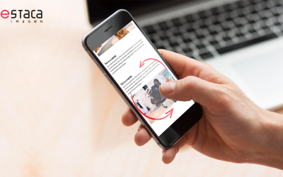
Responsive font in DIVI? Is that even possible? YES!!!! What is more, you can do it with any font type! So today we would like to tell you a bit about the Divi responsive font. We will show you how to adapt the font size to your screen, no matter if you look at the screen from different devices or if you reduce the size of your browser. We will use the VW (View Width) measurement unit, which is quite unknown.
Have a look at this video! It will clarify everything 😉
The font size of the first text is 7.2vw and the second is measured in pixels, which is 135px. As you can see in the first typography, it starts to reduce as we narrow the window. On the other hand, on the second text, the size is permanent and it reaches a point where it doesn’t fit in our column and it overflows it. 🙁
What is the VW measurement?
I am not going deep into the explanation of the different measurement units of our web, I will simply say that with DIVI we mainly have the px and the em. We can also work with other units such as “VW”. If you are interested in knowing more about this topic I really recommend the following post by Mozilla.
VW is a measurement unit related to the width of our device. So this means that 100 vw is the total width of our screen. For instance, if our device’s width is 1920px, 10vw would be a total of 192px. If the user makes the window smaller or the website is looked from a mobile device, this measure will always be related to this size. 10vw will always be 10% of the width of your screen. If the window’s measure is 1920px then 10vw equate to 192px.
How do we use the responsive font size?
It is pretty simple, instead of writing the px or em, we simply write vh on the measure text box that we want.

Important! You can combine different unit measures and sizes for each device. In fact it will be necessary for you to revise the values in your tablet or phone to avoid wrong results.

When is it interesting to use the responsive font in DIVI?
Using responsive typography is highly advisable on big titles that occupy the entire screen so therefore we can avoid linebreaks. That used to happen to us in our online shop home page and after constantly bumping into that problem this idea was created🙂.
If you are interested in this theme and you know how to use CSS, we invite you to explore the recent Clamp that allows us to establish the different font sizes depending on the resolution of the device.
Did you know that you can adapt the size of your typography to any device? Was this interesting? We hope it was! Comment and subscribe to our list to get the best hacks and suggestions like this one in your inbox.
Responsive Font in DIVI | Destaca


0 Comments